This Chart Is Predicting This Stock Is About To Plunge

While following a rising trend is usually the best way to make money in the stock market, chart reading can tell us where that trend is likely to run out of steam. And when we have a big stock like home improvement retailer Lowe’s (NYSE: LOW) soaring more than 20% in two and a half months, we really should see what the chart has to say about selling.
Let’s start with the big picture.
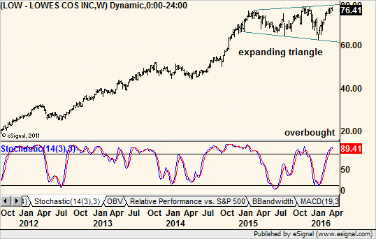
A weekly chart shows LOW tracing out a pattern that is rather similar to that of the S&P 500 — a big rally after the 2011 correction followed by a wide, two-year trading range that is still in place.

With trading ranges, I like to apply stochastics as a momentum indicator, and right now it says the stock is overbought. The near-term rally off the February lows was fast and furious, but now the stock looks tired. In fact, according to this indicator, it is more overbought now than it was at any other price peak since it first moved into the range in 2014 following a multimonth rally.
There is also a pattern on the above chart that has ominous overtones. While not a textbook example, the trading range set higher highs and lower lows, leaving an expanding triangle or megaphone pattern.
This is usually a topping pattern and tells us that each uptrend and downtrend within was more excited than the previous one. I say “excited” and not “exciting” for a reason. Whatever drove those trends left the stock more volatile and confused with each change.
The problem is that the pattern does not flash a sell signal until the lower border is broken to the downside, and that leaves a lot of money on the table for those who wait. That is why we need to zoom in to the daily chart for a more tactical analysis in the strategic framework of a topping pattern.

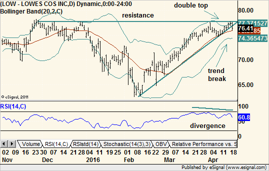
The current rally leg made it back to the same level as the 2015 peak where resistance is strong. Momentum indicators, such as the Relative Strength Index (RSI), show a lower high as price made a higher high. This divergence between price and indicator, especially at a support or resistance area, is usually resolved with a change in price trend, which is bearish in this case.
I also want to note that the chart of peer stock Home Depot (NYSE: HD) displays a similar short-term pattern but does not have the same long trading range in place. Instead, it sports twin peaks in 2015 and 2016 that suggest a double-top is forming. Here, too, the pattern does not flash a sell signal until the bottom border is broken, so there is a lot of room to fall before that happens. The point is we have two similar stocks with two different topping patterns.
What caught my eye with Lowe’s was that the stock fell more than 1% on Tuesday when the broader market had a nice day. In fact, LOW broke its short-term trendline to the downside and completed another non-textbook but bearish pattern.
This time, it was a three-day candlestick formation called an evening star. Friday was a nice up day, Monday was a small range day that set a new high for the rally, and Tuesday was a big down day. It may not be a classic version, but it does meet the spirit of the reversal pattern.
Finally, we have a double-top within standard Bollinger Bands. Here, too, the pattern is not perfect but the spirit should prevail.
The early and mid-April highs formed a small double-top with the second high slightly above the first. The pullback between the two highs tested the middle moving average within the bands, but the second peak managed to poke its head above the upper band.
A perfect pattern would have the first, not the second, peak above the bands to demonstrate waning momentum between them. However, since we have a clear bearish divergence between price and the RSI indicator mentioned earlier, we can forgive this.
To summarize, we have weekly exhaustion, daily waning momentum, a Bollinger Band double-top and weak performance on a fairly good market day that broke a short-term trendline to the downside. Plus, LOW already booked a full bull market since February, and nearby resistance looks strong.
All in all, even if the market pushes higher, Lowe’s looks ready for a tumble on its own technical merits.
Recommended Trade Setup:
— Sell LOW short at the market price
— Set stop-loss at $ 79
— Set initial price target at $ 68.50 for a potential 10% gain in four weeks
Note: You could turn that 10% move in LOW into a 124% profit by risking just $ 625. Find out how here.


