
The Last Time The Market Did This, It Didn’t End Well
There was an inordinate number of new highs AND new lows on the exchanges today, a condition that has spelled trouble for stocks in the past.
Even aside from yesterday’s historic election results, the action in financial markets was downright epic. It certainly makes selecting one Chart Of The Day a difficult prospect. There were so many gyrations, buying frenzies and selling panics that we hardly know where to begin. Because so many have covered the stunning equity rally off of the election night lows, we’re going to go in a different direction. To the extent that any of today’s monumental trading actually contained meaningful signals, we’re going to present a few charts demonstrating why the rally may not have been quite as robust as it appeared. Now, we’re not trying to minimize a 1000+ point reversal in the Dow. But there were a few items that didn’t quite jive with a rally that large.
Bad Breadth
First off, while the stock indexes put in hefty gains by the end of the day, breadth was not nearly as strong by comparison. Specifically, though the S&P 500 gained more than 1% on the day, NYSE Advancing issues outpaced Decliners by a relatively thin margin of 1698-1386. And while bond-related issues may have had a large impact on the data, at barely 55% of issues traded, this marked the weakest showing by NYSE Advancing Issues on a day the S&P 500 gained over 1% since October 2008.
Since 1970, there have now been 70 occurrences whereby the S&P 500 gained at least 1% while NYSE Advancing Issues accounted for less than 55.5% of all issues. 32 occurred between 1970-1997. Another 32 took place during the great breadth divergence of 1998-2001. In the past 15 years, however, this situation has occurred just 5 times.
What are the ramifications here? Intuitively, one would think that the “less good” breadth would be a negative omen for stocks. However, while prior events led to some suspect performance in the very immediate-term, by 1 month out, median returns had reverted close to those following all days. So while this data point might make for some interesting trivia, it doesn’t look likely to be of much consequence in the longer term.
The Junkie Market Is Back (Too Many Highs AND Lows)
This statistic almost escaped us today since it really wasn’t on the radar recently. Folks may be somewhat familiar with the “Hindenburg Omen”. This is a signal with bearish implications for stocks – as the name would imply. And while there are several criteria involved in the signal, the main tenet is an abundance of both New 52-Week Highs and 52-Week Lows. For whatever reason, those conditions were supposedly negative for the stock market’s prospects.
Well, like we typically do, we wanted to verify those HO claims rather than accept them as truth. At least, we wanted to test the tenet about lots of New Highs and New Lows. What we found testing our own simple version of the indicator is that there is indeed something to this notion – at least based on historical performance.
Our most recent look at this abundance of New Highs and Lows came in July–August 2015. In those posts, we looked at instances when the number of New Highs AND New Lows totaled at least 100, on either the NYSE or Nasdaq exchanges, or both. Now, we know that a static number will represent a different % of the total based on the rising or declining number of issues on an exchange over the years. However, it just so happens that the round number of 100 has been a pretty good marker for the purposes of this indicator lately. And obviously the warning sign for stocks implied by the large number of New Highs and Lows that triggered last July-August proved to be a valid one as the market would tank in late August and again in early 2016.
We bring this Junkie Market idea up again because both the NYSE and the Nasdaq reported more than 100 New Highs and New Lows today.
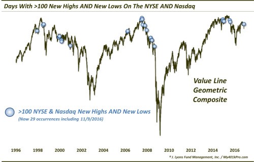
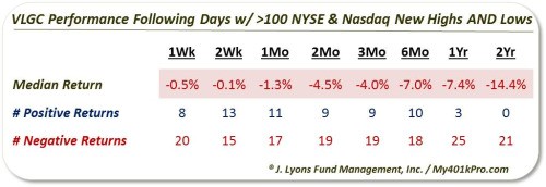
The chart illustrates just how timely, from a bearish perspective, these signals have been. In fact, as measured against the Value Line Geometric Composite, median returns across all time frames – from 1 week to 2 years – have been negative.
Will this indicator prove to be a canary again for stocks? We have no idea. Given the extraordinary pre and post-election market moves, it is possible this signal (and others) will be less reliable. However, based on our extensive research into this phenomenon, it has certainly been a consistent enough warning sign in the past to warrant our attention.
